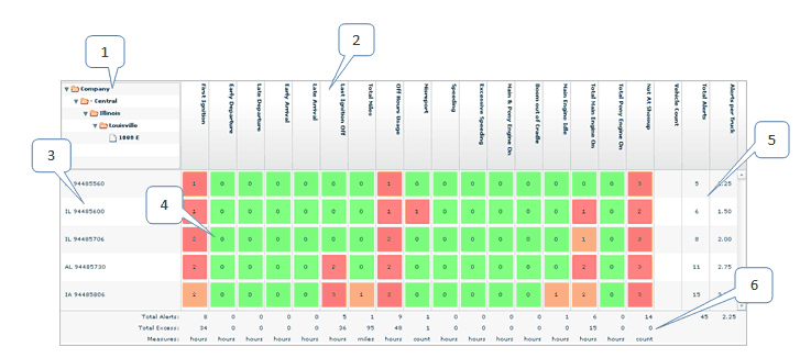
The Main Page
The main page provides an overview of how well your fleet is performing against a set of key performance indicators.

1: |
The hierarchy folders show which fleet you are examining. Each folder corresponds to a node in the hierarchy. When you first view the dashboard, you see the fleet of all vehicles you have permission to view. If you drill down for more detail on sub-fleets, the hierarchy folders expand to show which sub-fleets you are examining. Click a folder to return to a previous fleet. |
2: |
Columns are labeled with the KPIs that they represent. |
3: |
Rows are labeled with the sub-fleets of the fleet you are examining. Each sub-fleet corresponds to a node in the hierarchy. If you double-click the row label, the dashboard drills down to display data for that sub-fleet. |
4: |
Cells display either the count or percentage of events for the sub-fleet and KPI of the row and column. For more information on what these numbers mean, see How to configure the main page. |
5: |
At the end of each row, three columns summarize the information in the row. Vehicle Count shows the number of vehicles in the sub-fleet, Total Alerts shows the total count of events involving that sub-fleet, and Alerts per truck shows the average count of events per vehicle. |
6: |
At the bottom of each column a summary of the statistics for the KPI is displayed. The first row shows the total count of events involving that KPI. The second row shows the total by which all these events failed to meet the KPI target. The third row indicates the units of the second row. |