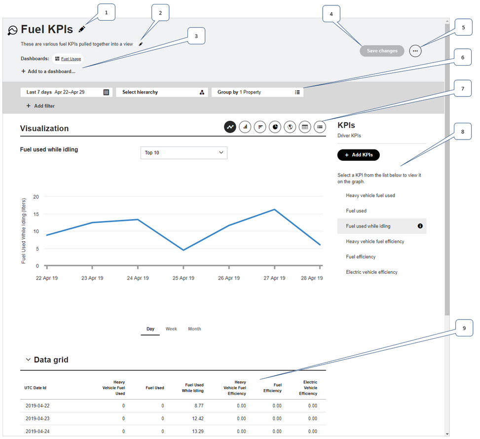
Filter - Use the filter to narrow down the data that is visible in this view.
7.
Visualization - Select the appropriate icon to display the data using the corresponding visualization method.
8.
KPIs - This list contains the KPIs that are part of this view. Select a KPI to show it on the chart. Click Add KPIs to add further KPIs to the view. This list is displayed underneath the data grid on narrower screens.
9.
Data grid - For all visualization methods a data grid of all KPIs contained in the view is displayed underneath the visualization.
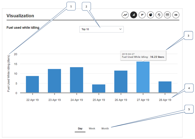
Visualization Methods
Line Chart
Click the Line Chart icon to view a line chart of the selected KPI in the KPI list.
The line chart contains the following information:
1.
The units that the KPI is measured in shows on the y-axis of the chart.
2.
Use this drop-down box to limit the data shown on the chart to the highest or lowest 10, 20, or 50 values.
3.
When you hover over a data point more details display in a pop-up.
4.
Dates show on the x-axis of the chart.
5.
Choose between seeing daily, weekly, or monthly data.
Column Chart
Click the Column Chart icon to view a column chart of the selected KPI in the KPI list.
The column chart contains the following information:
1.
The units that the KPI is measured in shows on the y-axis of the chart.
2.
Use this drop-down box to limit the data shown on the chart to the highest or lowest 10, 20, or 50 values.
3.
When you hover over a column on the chart more details display in a pop-up.
4.
Dates show on the x-axis of the chart.
5.
Choose between seeing daily, weekly, or monthly data.
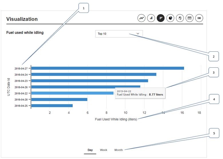
Bar Chart
Click the Bar Chart icon to view a bar chart of the selected KPI in the KPI list.
The bar chart contains the following information:
1.
Dates show on the y-axis of the chart.
2.
Use this drop-down box to limit the data shown on the chart to the highest or lowest 10, 20, or 50 values.
3.
When you hover over a bar on the chart more details display in a pop-up.
4.
The units that the KPI is measured in shows on the x-axis of the chart.
5.
Choose between seeing daily, weekly, or monthly data.
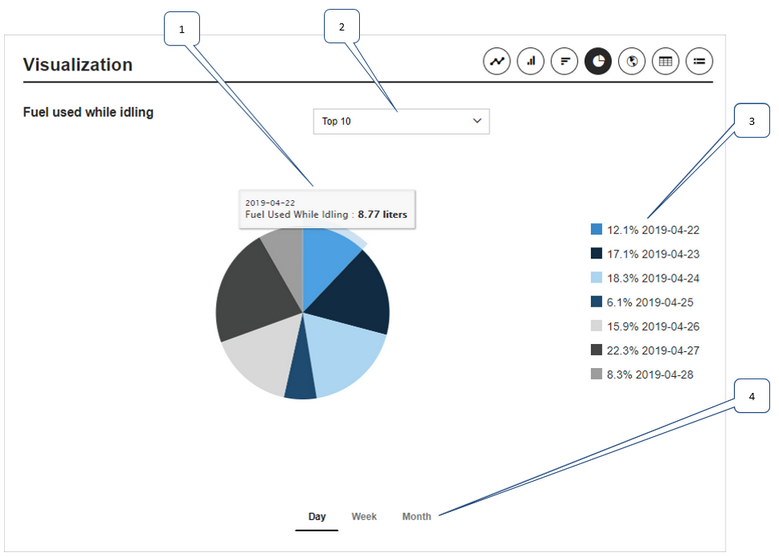
Pie Chart
Click the Pie Chart icon to view a pie chart of the selected KPI in the KPI list.
The pie chart contains the following information:
1.
When you hover over a slice on the chart more details display in a pop-up.
2.
Use this drop-down box to limit the data shown on the chart to the highest or lowest 10, 20, or 50 values.
3.
The legend displays which values match the colors in the pie chart
4.
Choose between seeing daily, weekly, or monthly data.
Map View
Click the Map icon to view a world map displaying the selected KPI per country.
The map view contains the following information:
1.
Use page scrolling actions to zoom in and out on the map. Click on the World button to zoom out, displaying the entire world.
2.
Hover over a country to display more details about the KPI in a pop-up.
3.
The legend shows the colors that correspond to particular KPI values.
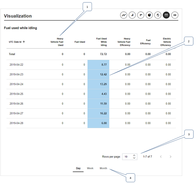
Table View
Click the Table icon to view a table displaying all KPIs with the selected KPI highlighted in blue.
The table view contains the following information:
1.
The KPIs are listed in the columns of the table.
2.
The KPI that is selected in the KPI list is highlighted in blue.
3.
Select the number of rows to display per page, and use the arrows to view the previous or next page of data.
4.
Choose between seeing daily, weekly, or monthly data.
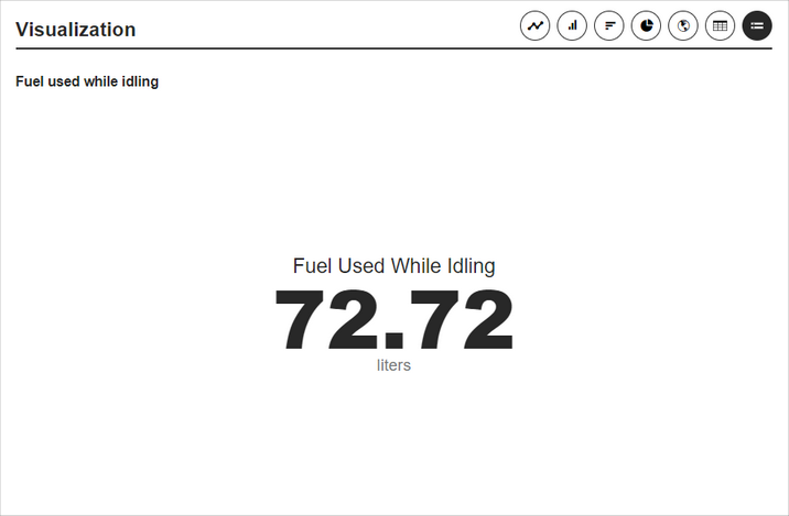
Summary View
Click the Summary icon to view a summary of the selected KPI as a single accumulated value.


 Previous
 Next
Next Expand/Collapse
 Print
Print Share Page
 Training
 Knowledge