Control Room
|
If your account includes a subscription for Control Room, an additional tab is shown below the Map when using a List view, together with other job-related options such as Jobs and Jobs Gantt Chart. |
Control Room is used to graphically display key route and job metrics, showing at a glance how jobs and routes in a given territory - or across all territories - are progressing, which routes are running late, and which jobs and routes might require your attention. These metrics can be displayed using a variety of conventional chart types such as bar and pie graphs, or as text-based tables, depending on the metrics you choose:
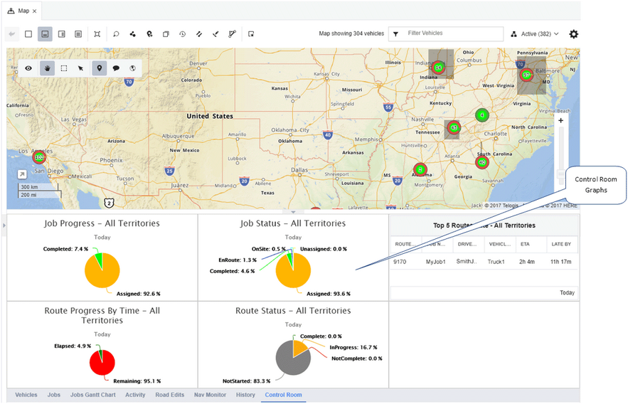
Individual graphs can be configured to display data for one specific territory, aggregate data for all territories, or to update depending on the territory currently shown on the map.
Grid Configuration
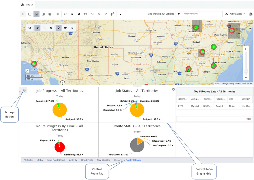
The Control Room tab displays graphs in columns and grids (up to a maximum of five columns and five rows, permitting up to 25 different graphs to be shown at one time). To open and configure the Control Room tab, open the main menu to the left of the screen, and then and click the Map menu option. When the Map screen opens, click one of the List views on the menu toolbar. When the list opens above or beside the map, click the Control Room tab.
To configure the grid layout of the tab - and save or select a particular grid layout - hover your mouse anywhere within the Control Room tab to activate the Settings button ( ) in the upper left corner of the Control Room tab, and then click it.
The Layout Settings dialog opens:

1: |
Click and open the Layout menu to choose a layout configuration saved previously. Once selected, click the Load button ( |
2: |
Click the Delete button ( |
3: |
Click the Load button to update the Control Room tab with a grid configuration chosen from the Layout menu. |
4: |
The name of the current grid layout. |
5: |
The name of the current grid layout, as editable text. To change the name of the layout, or give a new layout a name, change the text or enter new text and then click the Save button. |
6: |
The number of horizontal rows in the grid layout. Use the up and down arrows to increase or reduce the number of rows, or type a number between one and five. |
7: |
The number of vertical columns in the grid layout. Use the up and down arrows to increase or reduce the number of columns, or type a number between one and five. |
8: |
Click the Save button to save any changes to the graph layout. If you change the settings of your individual graphs, you will need to open this dialog and save them by clicking this button. |
Graph Configuration
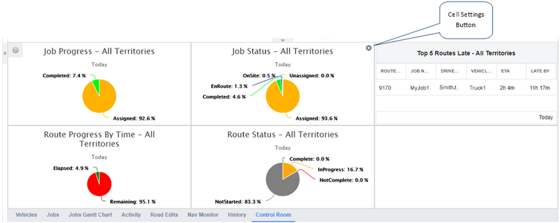
Once you have configured the number of grids and rows you want visible on the Control Room tab using the Layout Settings dialog, you can then configure the individual graphs contained within each grid cell. To configure, click anywhere within an empty cell, or hover your mouse over a cell that contains a graph and then click the Cell Settings button () in the upper right corner of the cell:
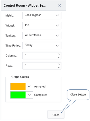
The Widget Settings dialog opens:

Open the Metric drop-down menu and select the metric graph you want shown in the grid cell.

Metrics you can choose are:
| • | Route Status - this graph shows the status of routes (Complete, In Progress, Not Complete, or Not Started) in the selected territory. |
| • | Job Status - this graph shows the status of jobs (Assigned, Completed, En Route, On Site, or Unassigned) in the selected territory. |
| • | Job Progress - this graph compares two job statuses across a chosen territory, 'Assigned' and 'Completed', providing a high level overview of how closely drivers' actual job completion rates ('Completed') compare with their completion targets ('Assigned'). |
| • | Top 5 Routes Late - this graph shows the five routes within the selected territory running latest. Their order of lateness is determined by identifying all current jobs that have an ETA, and either a 'late' or 'running late for planned arrival' condition. This pool of jobs (and by association their assigned routes) is then ranked by their anticipated arrival time at the job site (in other words, an estimated arrival time farther in the future will increase the rank of the route containing the job). |
| • | Route Progress By Time - this graph shows two values: 'Elapsed' representing the total number of route hours or the percentage of all routes completed within the selected territory, and 'Remaining': the number of hours or the percentage of routes that have not yet been completed. |
Next, open the Widget drop-down menu and select the style of graph you want to use to display your chosen metric.
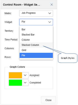
Graph types you can choose are:
| • | Bar - a horizontally-oriented bar graph representing all status values as individual bars, with status count values shown across the X axis. Available for 'Route Status', 'Job Status', and 'Job Progress' graphs. |
| • | Stacked Bar - a horizontally-oriented bar graph containing a single horizontal bar divided into percentages representing each status across the X axis. Available for 'Route Status', 'Job Status', 'Job Progress', and 'Route Progress By Time' graphs. |
| • | Column - a vertically-oriented bar graph representing all status values as individual bars, with status count values shown up the Y axis. Available for 'Route Status', 'Job Status', and 'Job Progress' graphs. |
| • | Stacked Column - a vertically-oriented bar graph containing a single vertical bar divided into percentages representing each status up the X axis. Available for 'Route Status', 'Job Status', 'Job Progress', and 'Route Progress By Time' graphs. |
| • | Grid - a simple text-based table containing status types and their counts for the territory, or late route details. Available for 'Route Status', 'Job Status', 'Job Progress', 'Top 5 Routes Late', and 'Route Progress By Time' graphs. |
| • | Pie - a conventional pie chart divided into slices that represent the percentage of each status type present. Available for 'Route Status', 'Job Status', 'Job Progress', and 'Route Progress By Time' graphs.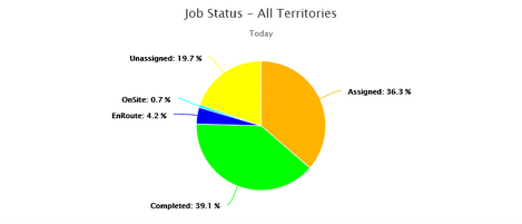 |
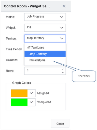
Open the Territory menu and select the territory that your chosen metric will be generated for.
Territory options you can choose are:
| • | All Territories - displays aggregated data this metric from all of the territories you have configured. |
| • | Map Territory - dynamically updates the graph to display data for the map territory you have open, updating every time you change map territory. |
| • | [Territory Name] - the names of each individual territory you have configured ('Philadelphia' in the example below). The metric graph displays only data for this single territory, regardless of the territory shown on the map or selected from the territory selector tool. |
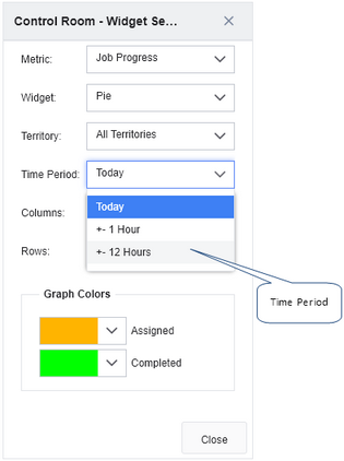
Open the Time Period menu to select the date and time range that the metric graph describes.
Time ranges you can choose are:
| • | Today - displays data for the current day, starting at midnight. |
| • | +- 1 Hour - displays data for a two hour period centered on the current time (the previous 60 minutes and the next 60 minutes). |
| • | +- 12 Hours - displays data for a 24 hour period centered on the current time (the previous 12 hours and the next 12 hours). |
Next, use the Columns and Rows fields to specify how many grid columns or rows the graph will occupy. The more of either you specify, the wider or taller the graph will appear in the grid. Note that if graphs have been configured in neighboring cells, increasing these values might cover some of these other graphs. These values also cannot exceed to number of rows and columns configured for the Control Room grid itself (on the Layout Settings dialog).

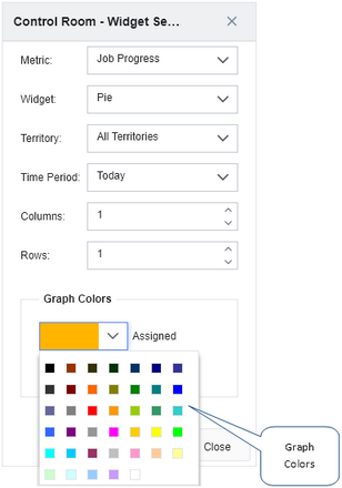
Open the Graph Colors color pickers to choose the colors used to represent job and route statuses, or route progress statuses. Colors are not required for text-based, 'Grid' tabular metrics.
Click the Close button to close the Widget Settings dialog. Note that your new graph settings will not be permanently saved with the current grid layout until you have opened the Layout Settings dialog and clicked the Save button.
 Previous
 Next
Next Expand/Collapse
 Print
Print Share Page
 Training
 Knowledge
 ) to update the
  ) to delete the currently selected grid layout.